Designing The Modern Web
Who Am I?
- Sam Richard
- Sr. Front End Developer, NBCUniversal
- Snugug on Twitter, GitHub, The Internet
- Co-Organizer of Team Sass, SassConf
Congratulations! You're in the Pizza Business!
Design Your Website!
The Dao of Web Design
Ritual
Well established hierarchies are not easily uprooted;
Tao Te Ching; 38 Ritual
Closely held beliefs are not easily released;
So ritual enthralls generation after generation.
Before the web, there was print. Hundreds of years of print.
Before there was print, there was writing. Thousands of years of writing
It was only natural than that the web borrowed heavily from print
When a new medium borrows from an existing one, some of what it borrows makes sense, but much of the borrowing is thoughtless, "ritual", and often constrains the new medium. Over time, the new medium develops its own conventions, throwing off existing conventions that don't make sense.
This happened with the transition from radio to television
Often referred to as "radio with pictures", early television followed the format of popular radio, even at times narrating scenes that the audience could see as if they could not
It happened with the introduction of music videos as well
Early music videos were mostly the band miming themselves playing a song
In both cases, the thoughtless rituals of their parent mediums were cast off while the ones that made sense to new medium's conventions flourished.
Television evolved genres and formats suited for visual story telling
Artists found that they could visually express themselves and their music in ways other than a mimed concert
Although the web medium sprang from print, print's conventions have for too long overshadowed the realities of the web
The web has been treated as if it were made of paper
It is time for the web, like other new mediums before it, to cast off the constraining rituals of the medium from which it emerged
Control
The sage… accepts the ebb and flow of things,
Tao Te Ching; 2 Abstraction
Nurtures them, but does not own them…
One of the core understandings of print is that
What You See Is What You Get
The designer has absolute pixel-perfect control over the design
There is a fixed content size, fixed display size, fixed viewing mode
Guess what. The web’s not a laser printer.
Karen McGrane
What if print's control is really a limitation?
You can think - we can fix the size of the text - or you can think - the size of the text is unalterable
You can think - the dimensions of a page can be controlled - or - the dimensions of a page can't be altered
In Print's Limitation We Find The Web's Strength:
Flexibility
The Way
The Way is shaped by use,
Tao Te Ching; 32 Shapes
But then the shape is lost.
Do not hold fast to shapes
But let sensation flow into the world
As a river courses down to the sea.
Form should follow function
Start with what your pages do, not what they looks like
Regardless of how they got there, users are there for your function, not your form
Users come to your site for the content, so you should design content first.
Your content and your site needs to be predictable in order to be useful.
Your site needs to be fast and reliable in order to be usable.
You need a style that will reflect your brand and can be carried from your content up
Only after all other needs have been met should you focus on visual flair
Visual flair should not negatively affect any of the other needs
Let your design flow from your content
Let your user flow around your site
Tend to any rocks in your stream
Be fluid as water
Look At Your Website
Now Back To Me
Now Back To Your Website
Now Back To Me
Does Form Follow Function?
Is It Easy To Navigate? Predictable?
How Prominent Is Design Flair? Social Media?
Would You Like To Take Another Stab At It?
Content Strategy
Change
Probably the largest shift when designing the modern web is how the process starts
No longer is a picture of a page good enough to get started, we need to start with our content first
Content Strategy is broken up into 5 sections
- Project Vision
- Content Inventory
- Content Audit
- Content Modeling
- Information Architecture
Project Vision
Before we can know what content will best serve our site, and what features will best serve our content, we need to know what the goal of our project is.
This can be accomplished by writing a Vision Statement
Your vision statement should answer the following questions:
- Who will use, buy, or consume the product?
- Who is our target customer?
- Who will administer and maintain the product?
- What needs will the product address?
- What attributes are critical to success?
- How does the product compare with existing products?
- What are the unique selling points?
A vision statement provides a single grounding point for all decisions we need to make.
In order to provide for a well-informed electorate who want to stay up-to-date and relate to high quality relevant worldwide news and information on an ever growing array of platforms, our editorial team will utilize an easy-to-use platform that can be accessed from any device from across the world to quickly and effortlessly updated and create new stories.
Content Inventory
A Content Inventory takes an objective, broad strokes look at content currently on a site
Generally built as a spreadsheet, it includes both intrinsic (title, owner, last updated) and analytical (page views, page rank, notes) data
Content Inventories aren't just about pages, they are about the different pieces, or chunks, that go into making those pages
Do not try and inventory all of your pages - that's impossible. Instead only try and realize the truth.
What truth?
There is no page.
There is no page?
Then you will see that it is not the page that matters, it is only your content.
Content is not not just long blobs of text, it's also images, videos, charts, and any other forms of information your user may want from you
We're interested not only in the types of content, but in their attributes as well, the chunks that make a piece of content what it is.
We then record this all in our spreadsheet

Content Audit
A content audit provides you with a first look at how your content is written as way to suss out if what you currently offer is worth keeping, editing, or removing.
- Is the content too long, too short, or just right? Can longer content be cut into shorter chunks and still make sense?
- Is the copy wordy? Does it ramble? Can you clean it up without loosing its meaning?
- Does each page or chunk get to the point quickly?
- Is the content even broken up into chunks?
- Is the content relevant and important?
After evaluating your content, start editing and cutting! Not everything needs to make the final site!
You're now in a position to do a gap analysis of your content
- Keep as-is
- Revise and edit to tighten it up
- Delete because it's irrelevant, not useful, or outdated
- Create new where new business goals don't meet existing content
Content Model
A content model is an overview of the different types of content available on your site
Each piece of content is modeled to include its attributes, what makes it up, its metadata.
A good content model includes both visible and structural attributes.
Metadata is the new art direction.
Ethan Resnick
Each content type should include the following:
- Title: of content type
- Description of content type
- Benefit Statement written in the form of
As [persona], I want [desire] so that [rationale] - Value of content type. Will help to prioritize development tasks.
- Attributes that make up a content type. Should include data limits per attribute, such as character limit or date date format
- Relationships that the content type has to other types of content
Article
Description:
- Short to long form text with possible accompanying images of recent factual stories
Benefits:
- As a reader, I want the most up-to-date information about the state of the world so that I stay informed as a citizen
- As a site owner, I want to increase traffic to our site during peak news stories so that we enhance our standing as a world leading news source
Value:
- Page views per Year: 25,000 Page Views per year
- Revenue per Ad per 1,000 Page Views: -$0.10
- Revenue per Ad per Year: $450
- $447.50 Nett Ad Revenue per Year
Article
Attributes
-
Title
- Total: 1
- Required: true
- Type: text
- Character Limit: 127
- Description: A descriptive title of the content
-
Published Date
- Total: 1
- Required: true
- Formatting: mm/dd/yyyy hh:mm
- Description: Date, including hour and minute, of when article was published
-
Primary Image
- Total: 1
- Required: false
- Type: reference (image)
- Description: Primary image for article
Information Architecture
Information architecture (IA) is all about what pieces of what content get used when, where, and why
IA tends to be implementation-specific, but should always share the same underlying content
Building out an IA can help you flush out your Content Model
There are four good rules of thumb to follow while building your IA and revising your Content Model
- Truncation is not a content strate…
- Build systems of content
- Content should be easy to navigate
- Content should be available
Truncation is not a content strate…
- Content that is truncated is usually not written for summary or reuse
- Truncated content usually doesn't contain trigger words
- Especially true for headlines. Never truncate headlines.
so…
- Always provide summaries for long copy
- Provide alternative copy when needed
Build systems of content
- Content isn't always one-size-fits all
- Allow for different sizes and styles of content attributes
- Small, medium, large images
- Short and long human readable and SEO friendly headlines
- Do not build for specific context like iPhone, Android, Tablet, or Desktop
Content should be easy to navigate
- Don't paginate long pieces of content unnecessarily
- Make it easy to navigate to sections in long pieces of content
- Always provide enough context for a user to make their own navigation decisions
- A user with location services might not exclusively want location-based information
- Provide plenty of trigger words - words that inspire users to act as the outcome is obvious
- Think about if headlines can be used as links, or if alternative copy should be used
Content should be available
- Don't restrict content based on device
- Provide alternative formats of content if one format can't be made available, such as through device capabilities or business needs
- Do not store tabular data as an HTML table, but rather as raw data that can be presented in multiple ways
- Make all of your content available and in a way that makes sense
Good Content Strategy is like a Good Pizza
Made of the finest ingredients
Mixable and reusable fixins
Easily slice-able
All on a solid foundation
I'll Take A Slice of Content Strategy
Mobile
Usage
It is 2x more likely that [mobile] users will spend 4x more time on your site than those using IE8
Jason Pamental
Mobile's a Big Deal
- 57% of All Americans go online using a mobile phone
- Mobile Internet usage has increased by more than 30% in the past 3 years
- 85% of young adults 18-29 and 73% of adults 30-49 use the Internet on their phones
- 74% of those who identify as Black, non-Hispanic and 68% of those who identify as Hispanic use the Internet on their phones
Mobile's Erasing the Digital Divide
- 34% of mobile Internet users, about 20% of All Americans mostly use their phones for going online
- Mostly mobile users have increased 7% in 2 years
- 50% of young adults 18-29 and 35% of adults 30-39 mostly go online from their phones
- 43% of those who identify as Black, non-Hispanic and 60% of those who identify as Hispanic mostly go online from their phones
If your content, all of your content, isn't available and usable on mobile, you are not reaching your audience.
7 Deadly Mobile Myths
[L]ike the “dial” tone, the “return” key, and “cut and paste”, the word “mobile” has expanded to mean something different from its analogue in the physical world.
Karen McGrane
We are hampered in both discussion and design by assumptions we make about mobile based on its physical world analogue
These mobile myths need to be dispelled in order for us to be effective.
1. Mobile Users are Rushed and Distracted
This myth tends to materialize as a pared-down site
Sections get removed, content hidden, interactions that require deep commitment are reserved for the desktop
Often, mobile sites are thought of as the companion or lite versions of a site
Any time you say somebody won't want that on their phone, you're wrong.
Josh Clark
One third of all traffic to the to 50 e-commerce sites come exclusively from mobile
91% of "tablet" user and 90% of "smartphone" users accessed e-commerce websites, compared to 78% of "desktop" web users.
eBay sells almost 10,000 cars through mobile devices each week
88% of US Consumers use their "mobile" device while watching TV
63% of people use their "mobile" devices regularly to help with cooking.
75% of mobile phone users use their phone while on the toilet
While a user may be rushed or distracted while on mobile, they are not exclusively so
We use our devices on the couch, in the kitchen, in the bathroom, and during 3 hour layovers
Making assumptions that certain content isn't right for mobile because it requires extended attention is always wrong.
2. Mobile Equals Less
In April of 2012, renowned User Experience researcher Jakob Nielsen suggested that a separate mobile site with reduced content focused on a mobile context should be our default.
Don't Confuse Context With Intent
Jakob's conclusion stems from the myth that we can assume intent from context
As it turns out, people will use any platform to do anything
All that we know about a user with a small screen is that they are a user with a small screen
Guess what, we are the same users regardless of the device we use
We're going to want all of the same content, no matter where we are or what device we choose to use
If content isn't important on mobile, maybe it isn't important
It all comes back to content. Our users are there for our content; give it to them
If users are overwhelmed by too much information on one screen, the answer is better design, not cut content
If it's not good for the mobile user, it's not good for any user. We're the same people.
Josh Clark
3. Complexity is a Dirty Word
We have a tendency to confuse complexity with complication
- Complexity: The richness of our experience and content
- Complication: The difficulty of using and navigating our content
The Challenge is creating Complex but Comprehensible Systems
We've been starting with large screens, so we've been lazy and throwing everything but the kitchen sink onto our pages
Starting small makes you do the hard work to reduce complication in your complexity up front
The lessons we learn at small sizes should translate to any size
4. Extra Tabs and Clicks are Evil
Humans have a rich tradition of story telling and conversation
Our conversational traditions have been how we've passed down stories and learned for generations
Instead of providing everything at once, allow a user to explore through your content, inviting conversation with them
Content should be Progressively Disclosed
- Respond as users ask for more information
- Focus on one item, push secondary items off waiting for user interaction
- Tap or click quality will always trump quantity
- Clarity always trumps density
5. Gotta Have a Mobile Website
Do not focus on only mobile websites, you need to have a great experience across all devices
We browse the web in cars, on TVs, on interactive advertisements in Times Square
Don't forget about accessibility! How does my website sound?

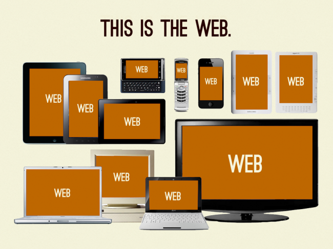
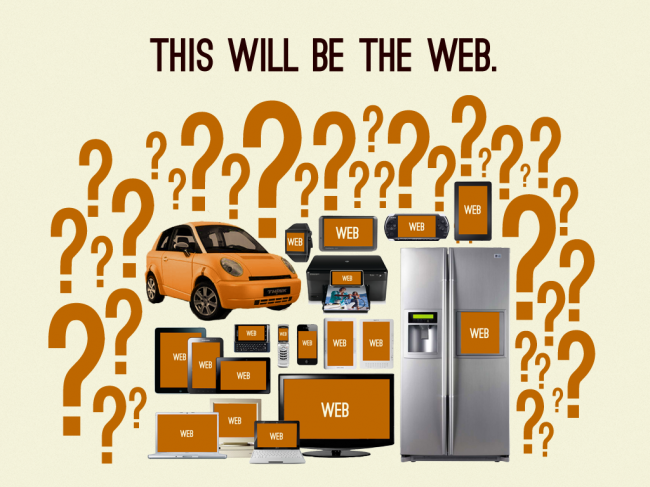
There is no need for separate mobile website
We are the same person, no matter the device
Don't punish users for the device they use
Be Future Friendly
6. Mobile is About Apps
An app is not a strategy. It's just an app.
Josh Clark
Presentations Deprecate
Design based on your content, not on a device or a trend
Your content is your product; everything else is just containers
You put water into a cup, it becomes the cup.
You put it into a teapot, it becomes the teapot.
Bruce Lee
Design from your content out, not container in
Your content should then flow into any container
Having context-independent content as your base will make adopting new presentations easy
7. CMSs & APIs are for Database Nerds
Your API is your content
Presentation isn't what's important, it's the content. That's what endures
In the 1980s, TV Guide realized they were in the content publishing business
They split into two; the magazine brand and the database of program content
All content was meticulously maintained by the database company with separate fields for each chunk that made up the content, including three different summaries per program!
In 2008, the magazine division was sold for $1
Build a common content backend
Design skills need to be pushed down the stack to the API and content chunk level
The goal isn't to repurpose design, it's to repurpose content
Mobile First…
It's not about mobile first (or just small screen first) – it's about content first. But it happens that thinking about what works for mobile does work for other things as well.
Jeffery Zeldman
When talking about "Mobile First", what we are talking about is using mobile as a focusing lens
Luke Wroblewski has a phrase he uses to describe this lens:
One eye, one thumb
Mobile devices require software development teams to focus on only the most important data and actions in an application. There simply isn't room in a 320 by 480 pixel screen for extraneous, unnecessary elements. You have to prioritize.
So when a team designs mobile first, the end result is an experience focused on the key tasks users want to accomplish without the extraneous detours and general interface debris that litter today's desktop-accessed Web sites. That's good user experience and good for business.
Luke Wroblewski
Focusing through the mobile lens also puts a large focus on performance
- 75% of mobile web users expect a site to load as fast or faster on their mobile device
- 60% of mobile web users expect a site to load in 3 seconds or less before leaving and not coming back
- If a user abandons your mobile site, 33% will go to a competitor's site, and 78% will only retry a site two times or less
What may seem like minuscule performance gains can quickly add up
- At Amazon, a 100ms delay costs 1% of sales
- At Google, a 500ms delay caused a 20% drop in traffic
These Statistics are from 2006!
The lessons we take from the mobile lens should not be restricted to our mobile presentation
We should carry them down our API into our Content Strategy
We should carry them up to our large screen presentations
We should carry them out to our native app presentations
Mobile users want to see our menu, hours, and delivery number. Desktop users definitely want this 1MB .png of someone smiling at a salad.
Mat Marquis
We're going on a field trip!
We're going outside to give mobile design on the go a go
Progressive Enhancement
The Web is an Inherently Unstable Medium
Ethan Marcotte
Take away what we can't know
- Screen size
- Device Capabilities
- Concurrent Activities
- Depth of Focus
- Purpose of Visit
Take away the make believe. Take away what we can't know. They're fantasies.
Jason Pamental
There is no mobile web, no desktop web. There is only the web
But the web is different things to different browsers
Don't think about "mobile content", think "what can this device do with the content

Do not work in device silos or try and categorize devices, it's meaningless
Each browser version on each device behaves differently, with more being released monthly. Attempting to categorize them all or target them individually is a fool's errand.
Instead, care about determining what features are available and enhance the experience based on those features
Start with a baseline experience
Enhance the experience when a user's browser/device pair is capable
Check to see how capable a browser/device pair is using feature detection
Ensure your content is available without enhancements
Throw away the phrase "Pixel Perfect"
Your site will look different across browsers
Responsive Web Design
'Responsive' is Not a Line Item. It's Design.
Jason Pamental
What Do You Need for RWD?
As outlined in Ethan Marcotte's Phrase-Coining A List Apart article, Responsive Web Design needs the three following things:
- Media Queries
- Fluid Grids
- Flexible Media
Media Queries
Media queries are a CSS3 feature allowing styling changes based on viewport based conditions
They are the key for tweaking our designs as they stop looking good
They tend to be abbreviated as breakpoints or tweakpoints
Start with the small screen first, then expand until it looks like shit.
TIME FOR A BREAKPOINT!
Stephen Hay
The best responsive sites will have many small tweakpoints to slightly alter a component's appearance
Fewer and farther between are breakpoints that make large appearance changes to the whole site
Usually you'll have between 20 and 50 media queries in a project
If You Find You Only Have 3-4 Media Queries, You've Probably Done It Wrong
In order to effectively create responsive sites, design really needs to be done in browser
It is impractical to create Photoshop files for each and every variation in a component and layout
Photoshop can be used as a sketch tool, but it cannot be used to make final design decisions
Fluid Grids
Why A Grid?
Grids enforce proportion and constraint on your design
They provide order and structure to your information.
The best grid is specific to your content and your design, as it is an extension of both.
Print Grids Are Easy
- Fixed display size
- Fixed content size
- One reading mode
- Limited additional user distraction
Web Grids Are Hard
- Many and varied display sizes
- Variable content lengths, sizes, and types
- Numerous reading modes
- Wide potential range of additional user distractions
We Cannot Think About Web Grids And Print Grids The Same Way
This Crap Doesn't Fly Anymore
Villard De Honnecourt, 13th Century
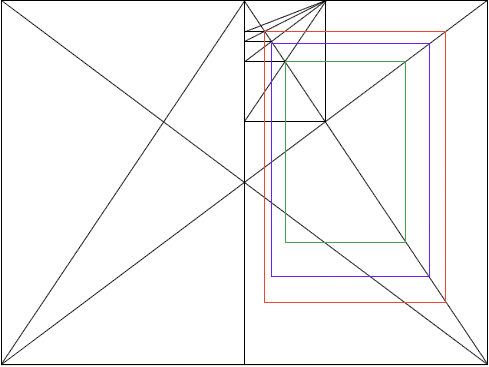
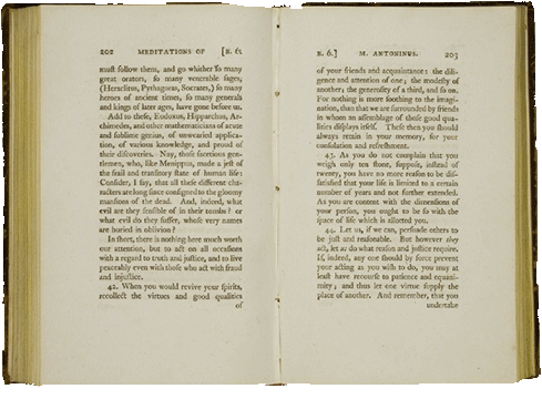
Villard De Honnecourt, Today
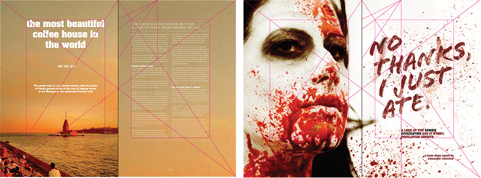
One Grid For One Context Doesn't Exist On The Web
There are two types of grids:
- Symmetric Grids: Each column is the same size
- Asymmetric Grids: Columns are different sizes
Symmetric grids are boring and don't help us enhance our content

Asymmetric grids are more interesting, providing new constraints to help us enhance our content
custom asymmetric grid
column sizes chosen by design needs

compound asymmetric grid
columns calculated by overlaying two symmetric grids

ratio asymmetric grid
columns calculated based on specific ratio

spiral asymmetric grid
calculated based on intersections of a spiral

Your grid does not need to stay the same throughout the whole spectrum of your design
As design needs change, so can the grid. But don't deviate from a grid once chosen
Flexible Media
Flexible media means two things:
- Media that fluidly fills the space it occupies
- Alternate forms of the same media
Fluid media is fairly easy to do entirely in CSS
- In CSS:
img, video { max-width: 100%; height: auto;} - Intrinsic Ratios for embedded media
Alternate media is much harder
- No standard for responsive images
- Editorially controlled content
- Based on image's size needs
- Still feels fast
- Audio and video are hard
- Different format support across browsers
- Cannot rely upon plugins being available
- No rights management
Still, all content must be available across all browsers and devices
Alternate media is where a well defined Content Strategy really shines
Makes it easy to provide alternatives when needed by the presentation
Don't Despair!
While the implementation of media queries, fluid grids, and flexible and alternative media is hard, lots of smart people have figured most of it out
The next set of trainings will help you learn how to implement a responsive site!
The Whole Pie
Let's put the whole pie in the oven!
Knowing what you do now, redesign your site
Thank You
Slides available at
http://snugug.github.io/designing-the-modern-web/